For schools, colleges and universities, inclusive design is about making each space work as effectively as possible for the people using it. Education environments need to support focus, wellbeing and accessibility, as well as withstand the demands of daily use.
This is especially important when designing with inclusivity in mind, where careful choices around colour, contrast, light and finish can help reduce unnecessary visual stress.
The priority is not to use more colour, but to use it where it can make the greatest difference.
Prioritising focus
Classrooms, libraries and small-group learning spaces need to support concentration. Overly vibrant, high-contrast or visually busy schemes can quickly become distracting, particularly for pupils who are more sensitive to sensory input.
A considered palette can help create a calm and supportive backdrop for teaching and learning. Off-whites, muted greens and blues are often useful starting points, helping spaces feel fresh without becoming stark. Crown Paints’ Victoria White, for example, can provide a gentler alternative to bright white, while shades such as Trailing Plant, a soft green, or Velvet Smoke, a muted blue, can introduce depth and interest in areas where a more settled atmosphere is needed.
Learning spaces also need to remain adaptable. Vintage Crush, a pink-toned neutral, or Cosy Night In, a deeper dusky mauve, can bring energy to areas used for group work, creativity or discussion, without overwhelming the wider scheme. These can be balanced with warm off-whites such as Sail White or Snowfall, helping the space feel calm and flexible.
The aim is not to strip classrooms of character, but to create a setting where colour supports learning rather than competes with it. By reducing unnecessary visual noise, displays, teaching materials and classroom activity can sit within a more balanced environment, helping pupils focus without making the space feel cold or clinical.
Light should also be considered before final colours are chosen. Colour is never static, and the same shade can change depending on natural daylight, artificial lighting and the time of day. Testing colours in the space itself, ideally using Crown Paints’ A5 real paint samples, can help ensure the final palette works in the conditions where it will be seen.
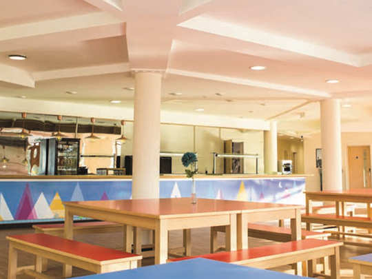
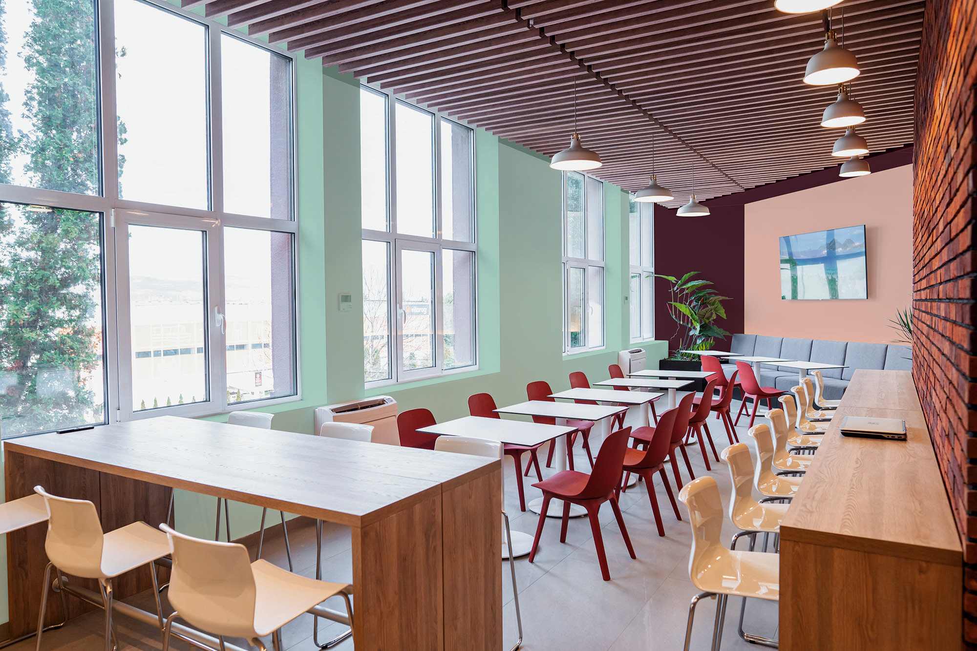
Supporting movement and orientation
Corridors, stairwells and shared areas are some of the busiest parts of an education building, so colour needs to do more than decorate. Used thoughtfully, it can help signal the purpose of a space as well as guide people through it.
Calmer tones can support focus in classrooms, libraries and welfare spaces, while brighter or bolder colours may be better suited to dining halls, breakout areas and common rooms, where the aim is to encourage collaboration and social interaction.
Colour can also support wayfinding. A change in tone between teaching areas, pastoral spaces and communal zones can help pupils, staff and visitors understand where they are and where they need to go. For neurodiverse users, these cues should be simple, consistent and easy to understand, helping to build confidence without making the environment feel busy or overwhelming.
Creating places to pause
Inclusive education design should also consider spaces for regulation and recovery. This might include sensory rooms, pastoral areas, SEND support spaces, wellbeing rooms or quieter corners within larger buildings.
These areas do not need strong colour to feel effective. In many cases, calmer palettes are more appropriate, helping to reduce sensory load and create a greater sense of ease. Muted greens such as Crown Paints’ Glass Green can bring a grounded, restorative feel, and a gentle yellow such as Narrative may add warmth to a support space without feeling overstimulating.
Staff areas should be considered too. A well-finished staff room or planning space can provide a useful shift away from busy teaching environments, using warmer tones or deeper accents to create a more distinct and restorative setting.
Balancing appearance with performance
In education environments, a successful scheme is not just about choosing the right colours. It is about specifying products that can keep those spaces looking good.
Classrooms, corridors, halls and dining areas all experience regular wear, from scuffs and knocks to frequent cleaning. Durable, washable finishes can help maintain a fresh appearance for longer and support the maintenance needs of busy estates teams.
Crown Trade Clean Extreme Scrubbable Matt is designed for demanding interiors where walls need to withstand repeated cleaning and retain a high-quality matt finish. It is well suited to classrooms and communal areas where appearance and durability both matters.
Washrooms, changing areas, kitchens and other moisture-prone spaces need additional consideration. Crown Trade Clean Extreme Mould Inhibiting Scrubbable Matt combines a durable, washable finish with mould-inhibiting properties, making it a practical option for these more challenging areas.
Woodwork and trim also play an important role. Door frames, skirting boards, handrails and other high-contact surfaces need a finish that can cope with everyday use. Crown Trade Fastflow Quick Dry Satin and Crown Trade Fastflow Quick Dry Gloss provide durable options for interior woodwork, with quick-drying formulations that can help reduce disruption during holiday or phased refurbishment works.
For areas where hygiene is a particular priority, such as medical rooms, nurseries or specialist education spaces, Crown Trade Steracryl Anti-Bacterial Scrubbable Matt may also form part of the specification.
A considered approach
Inclusive education design is not about making spaces overly decorative. It is about understanding how colour, finish, light and contrast affect the people using a building every day.
For schools, colleges, trusts and education estates teams, the lesson is clear. Colour choices should be focused where they can support concentration, movement, recovery and long-term performance. Paired with the right Crown Trade product specification, they can help create education environments that feel calmer, more accessible and easier to maintain.
When colour is chosen carefully and tested properly, it can do more than change how a space looks. It can help shape how an education environment feels, functions and supports pupils, staff and visitors every day.
For more information about Crown Trade’s colour and specification support, visit: www.crownpaintsprofessional.com
To order a free A5 PurePaint sample and see how your chosen shade could work in situ, head to: https://professional.crownpaints.com/specification-services/colour-service/purepaint-samples/